Johnny B Foods
A food sciene company. Johnny has developed an advanced knowledge of the science of healthy eating and developed formulations that are specially customized to the unique dietary needs of a wide range of people.
Project Overview
Website redesign & digital experience
Johnny B Foods is a food science company developing functional food formulations tailored to different dietary needs. The existing website needed a clearer structure, stronger visual identity and a simpler way for customers to discover recipes and place orders.
The goal was to transform the site into a clean, approachable digital experience that communicates the company's offering while making recipe discovery and ordering easier.
Role & Scope
- UX/UI Design
- Website Design
- Brand Identity
- Information Architecture
- Web Development
- Art Direction
- Client Communication
Objectives
- Modernise and improve the existing website
- Clearly communicate the company's offering
- Make recipes easier to discover and browse
- Create a simple ordering journey
- Improve readability, hierarchy and overall usability
- Establish a more consistent visual identity
Research & Discovery
I analysed the existing website to identify usability, visual and structural issues, while considering the client's business goals and the needs of customers looking for healthier food options.
Key findings
- Inconsistent visual design weakened the brand identity.
- Text placed over busy imagery created poor readability.
- Long paragraphs and lists made information difficult to scan.
- The site lacked clear navigation and visual hierarchy.
- The recipe and ordering experience could be significantly simplified.
Information Architecture
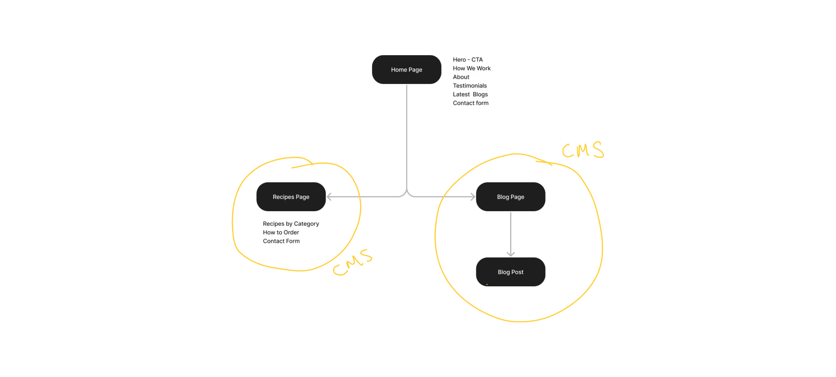
The existing content was restructured into a clearer site architecture with intuitive navigation and more purposeful user flows.
The structure was designed around the primary user goals:
Discover → Explore Recipes → Select → Order
UX & Wireframing
Two approaches were explored for the recipe experience:
Option 01 — Individual category pages
Each recipe category would have its own page and CMS collection.
Option 02 — Tabbed recipe experience
Recipe categories would be grouped on a single page, allowing users to switch between categories without navigating away.
The tabbed approach was selected because it reduced navigation and created a more direct path from recipe discovery to ordering.
Visual Design
Simple. Clear. Approachable.
The visual direction introduced a warmer, more contemporary identity inspired by the natural golden tones of freshly baked bread — one of the company's core recipe categories.
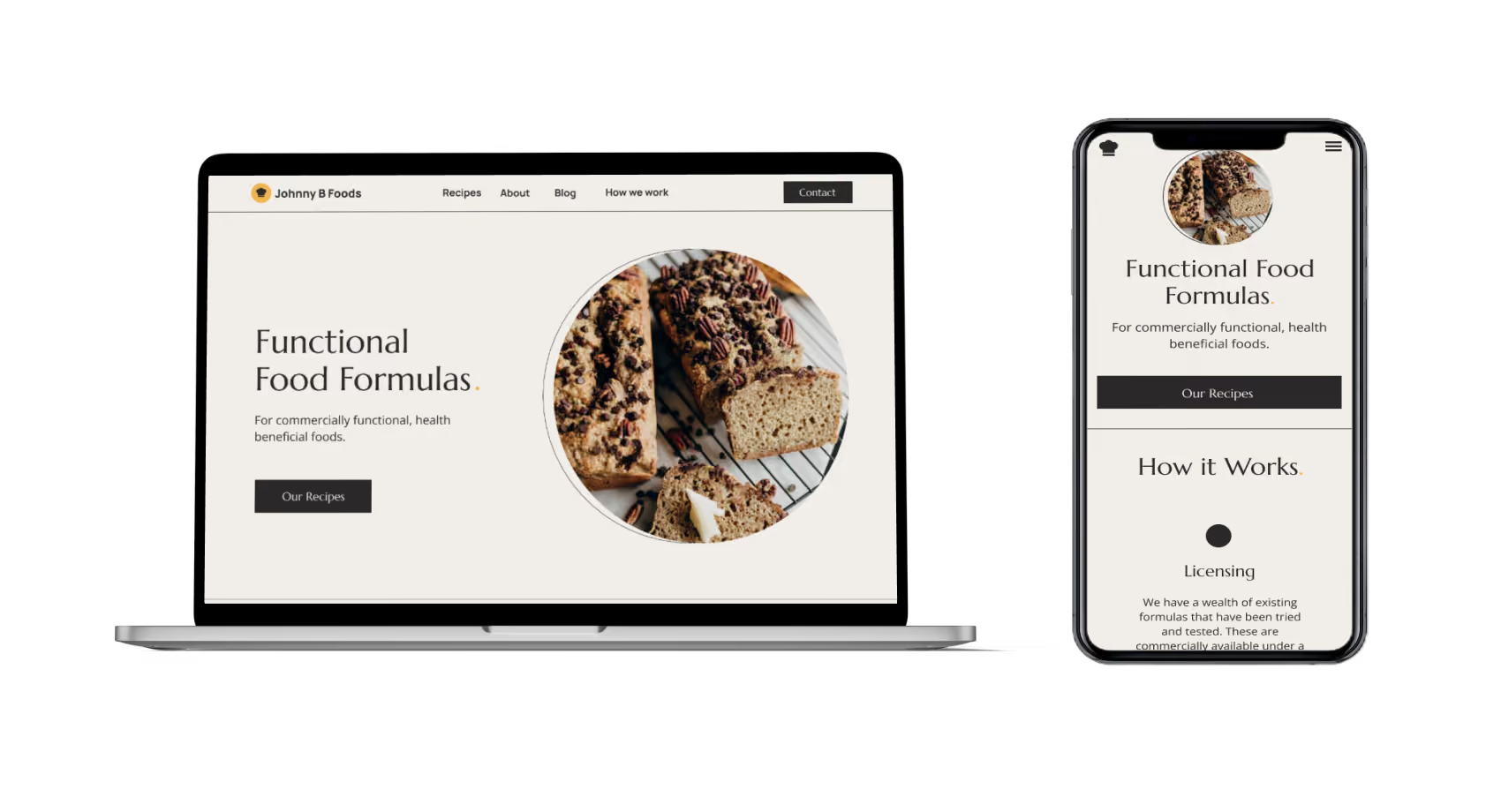
A restrained colour palette, contrasting typography and generous whitespace created a cleaner and more approachable experience.
Typography
- Marcellus was used for display typography and headings, paired with Open Sans for body copy and supporting content.
Colour
#F1EEE9#2A2829#EEB64E
The result was a visual system designed to feel premium without becoming inaccessible or overly decorative.
Final Design
A clearer digital presence.
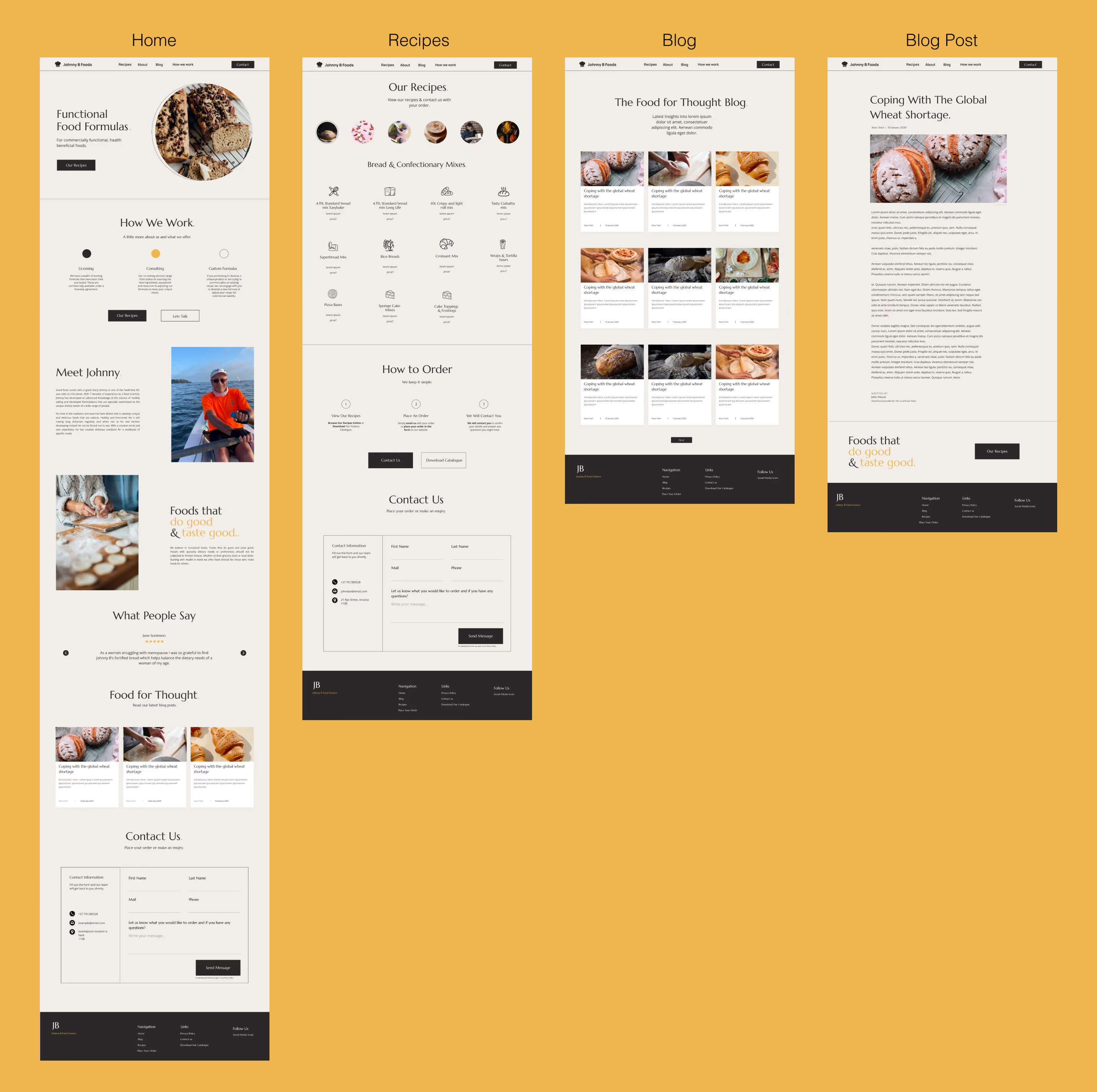
The redesign transformed the existing website into a more structured and visually engaging experience, with clearer navigation, stronger hierarchy and a simplified route to recipe ordering.
Homepage
- Strong hero with immediate Find a Salon CTA
- Structured footer navigation
- Branch discovery section
- Testimonial slider
- Services and downloadable price lists
- Social media integration
- Brand story section
Recipes
- Tabbed navigation between recipe categories
- Recipe information presented in a more digestible format
- Icons used to improve scanning and visual communication
- Order form positioned directly alongside the recipe experience
Blog
- Simplified content structure
- Clear article hierarchy
- Straightforward navigation between posts and related content
Booking
The website incorporated the client's online booking system, creating a direct path from discovering a salon or service to making an appointment.
Key Design Decisions
Recipe discovery → Reduced unnecessary navigation by bringing categories together into a single tabbed experience.
Ordering → Positioned the order form directly within the recipe journey rather than making users navigate to a separate ordering process.
Readability → Replaced busy image/text combinations with stronger contrast, spacing and typographic hierarchy.
Brand expression → Introduced a warm, minimal visual language that better reflected the company's food-focused offering.
Services Delivered
UX/UI Design · Web Design · Web Development · Information Architecture · Wireframing · CMS · Booking Integration · Copywriting
Tools
Figma for design and wireframing. Webflow for website development and CMS implementation.